Mapbox Studio

While at Mapbox I led design for Mapbox Studio, a web tool that helps developers, cartographers, and designers create beautiful and functional map experiences. I shipped dozens of features in my time there; here is a small selection:
Weather Data Visualization
One project I worked on was enabling weather visualization for engineers in newsrooms and at weather organizations. Raster MTS provided new support for GRIB files, and other standard weather formats. My job was to learn what users needed from this feature and provide support for it in Studio.

I added features to support:
- New categories of default color palettes to help distinguish between use cases for the colors (categorical, divergent, continuous)
- Modernized UI that supported creating color stops and assigning custom colors to different values coming in from the weather data
- Ability to step through different “bands” of the data (this usually encodes timestamps such as the rainfall every 6 hours) to preview styling with different values.
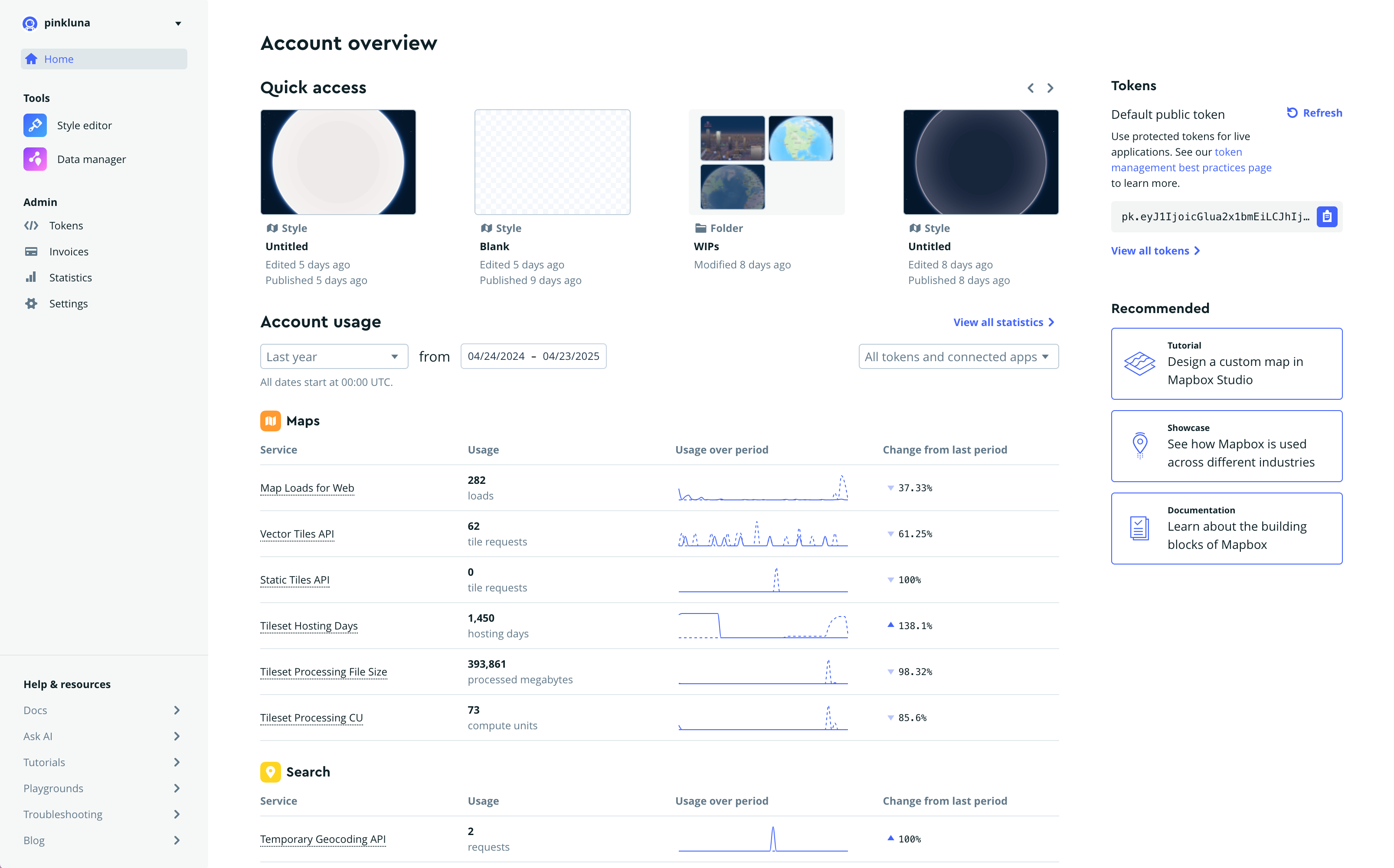
Developer Console
I was part of a tiger-team tasked with uncovering ways to improve the developer experience for Mapbox customers. We identified several improvement opportunities for the company, one of which was to have a more cohesive home for developers.
Previously we had a generic “account” page that new users landed in after signing up. With the new Developer Console, users were dropped into a home that would serve as the jumping off point for whatever Mapbox services they chose to work with.
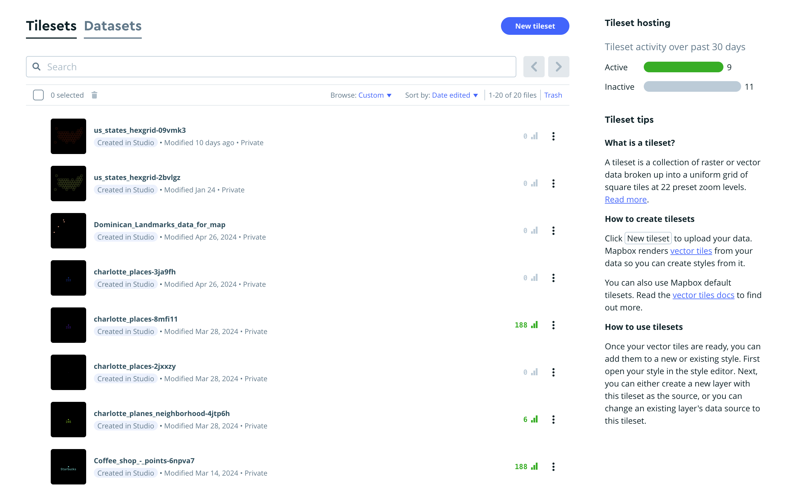
MTS Usage Data
Mapbox updated how they priced the usage of Mapbox Tilesets. As part of this effort I supported ways to visualize the new usage metrics in Studio.
I added a small usage indicator to each tileset that showed whether a tileset had any usage and what amount. And I added a sidebar to the list page that showed the distribution of active and inactive projects by the new pricing definition.
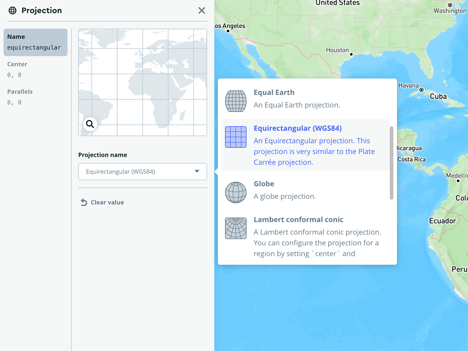
Map projections
As part of our launch of Mapbox projections, I created a set of icons to help users understand what different projections mean.
![]()
I then implemented the popover into the product with these icons adding the ability to switch between map projections in Studio.
Back to all projects